Responsive Web Design
It's a mobile world. Go responsive.
In a mobile world, your website needs to be far more than mobile-friendly, it needs to be responsive.
“The reality is, devices won’t automatically find pages that are mobile friendly. The answer is to make your site responsive.”
What does responsive mean?
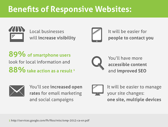
Responsive is when your website automatically conforms to the device that’s viewing it. The user experience is excellent, no matter what size your screen is. The font is easy to read, the menus are clear and accessible, and you don’t have to pinch and zoom to read the content.
Responsive design is no longer a consideration, it’s a necessity.
On November 18th 2014, Google released updated search result pages that identify when a website is responsive.
It’s too early to tell what the increased click through rate is going to be for these results, but it’s clear that mobile users would much rather click through to a responsive page.
According to comScore research, the number of mobile Web users has been on a steady increase, jumping from 400 million in 2007 to nearly 1.8 billion in 2014.
The reality is, devices won’t automatically find pages that are mobile friendly. The answer is to make your site responsive.
Ready to go responsive? Contact Treefrog today to discuss an upgrade.
Related Services:


